
Burst
Collaborative curation in social media communities
A social media app with content that feels niche, yet has the power to go viral.
All it takes is a

Burst
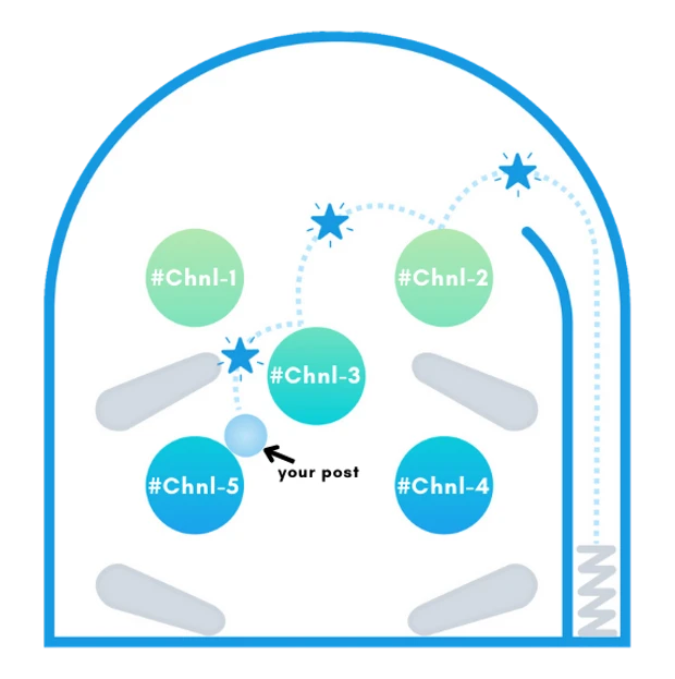
The hero’s (the post’s) journey on burst
ROLE
designer
developer
TIMELINE
sep 2023-
june 2025
SKILLS
ui/ux
research
front-end
TOOLS
figma
react native & react
javascript
01.
The Gap
Existing social media only operates in two main models:
Town square vs private groups
Town squares (Facebook, Twitter/X, and YouTube) emphasize broad visibility and popular voices but often lead to generic content tailored for mass appeal
Private-group platforms (WhatsApp and Discord) foster personal interactions but limit opinion diversity and encourage echo chambers.

The Challenge
How might we bridge the intimacy of personal interactions with the broad visibility of public platforms?
02.
A Sneak Peak
Basically, we made

Burst
A social media app that allows content to be curated,
and distinct communities, small and large, to remain interwoven
⊹ Burst is an interaction/button
and the name of our app
⊹ For research, functionality was
implemented before design
Burst
Collaborative curation in social media communities
A social media app with content that feels niche, yet has the power to go viral. All it takes is a Burst
designer
pm
developer
ROLE
SKILLS
TIMELINE
TOOLS
The hero's (the post's) journey on burst
01.
Town squares (Facebook, Twitter/X, and YouTube) emphasize broad visibility and popular voices but often lead to generic content tailored for mass appeal
Private-group platforms (WhatsApp and Discord) foster personal interactions but limit opinion diversity and encourage echo chambers.
The Gap
Existing social media only operates in two main models:
Town square vs private groups
Related
Features
1.
2.
3.
4.
Close friends: enable users to customize the visibility of their posts, tailoring content to different audiences. However, permanently blocks off conversation from public.
Crossposting: users post the same content in different communities manually (i.e. posting the same story in two communities on reddit). Discouraged & high user effort.
Alternative ranking algorithms: prioritize content that aligns with societal goals, not just engagement. Still no idea of audience per post, context collapse persists.
Despite solving for audience customization, these mechanisms are still designed around either private or public spaces.
04.
Prototyping & Implementation
sep 2023-
present
ui/ux
research
front-end
figma
react native & react
javascript
Basically, we made Burst
⊹ For research, functionality was
implemented before design
A social media app that allows content to be curated,
and distinct communities, small and large, to remain interwoven
The problem is in social media's core architecture—it's time to rethink the way wedesign it.
Mission 1:Feed
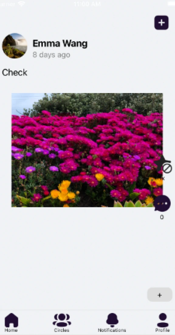
Burst feed before

1st iteration redesign
(Figma)

- button visibility issues
- design is not uniform
- crowded UI, text and
image format
- no strong visual
hierarchy
⊹ improved, clean UI
⊹ image prioritized design
⊹ interactions placed in
easy reach of the thumb
- buttons too close, limited
text length
How might wedesign a social media app with a mechanismthat blends the intimacy of personal interactions with the broad visibility of public platforms?
The Challenge (Specified)
We tested this model for a quarter but it ultimately was scrapped for a design that prioritizes text
Prototype Test: Photo-Based Feed
2nd iteration testing
(React Native)
1st iteration redesign
(Figma)
⊹ easy to access
channels at top
⊹ text prioritized design
⊹ features like
quote/repost
⊹ burst button integrated
with familar social media
design language
Final iteration testing
(React Native)
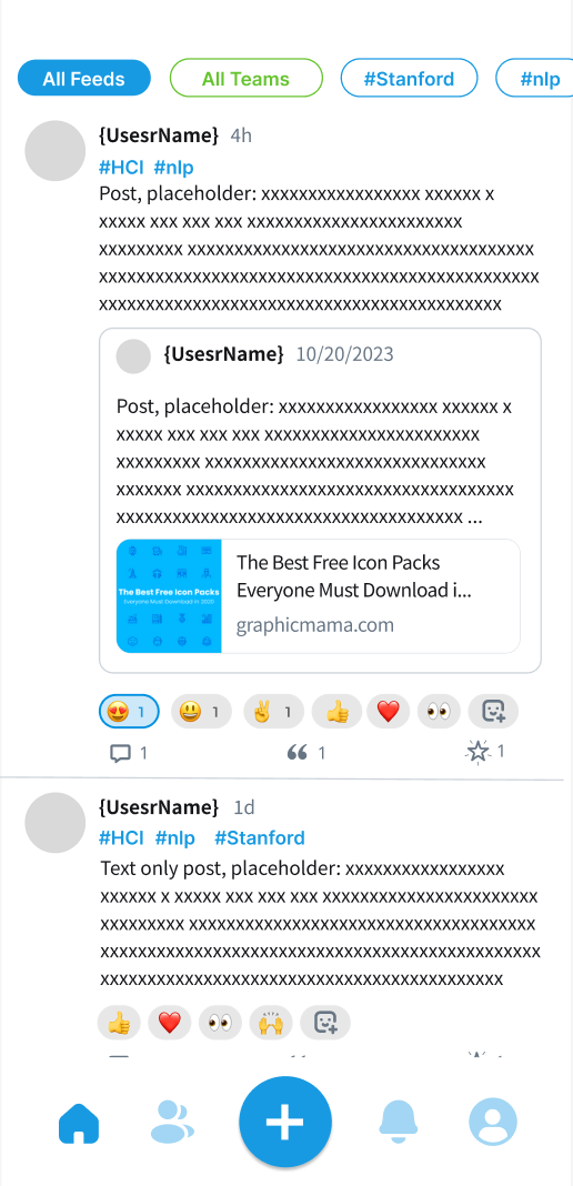
2nd iteration redesign
(Figma)
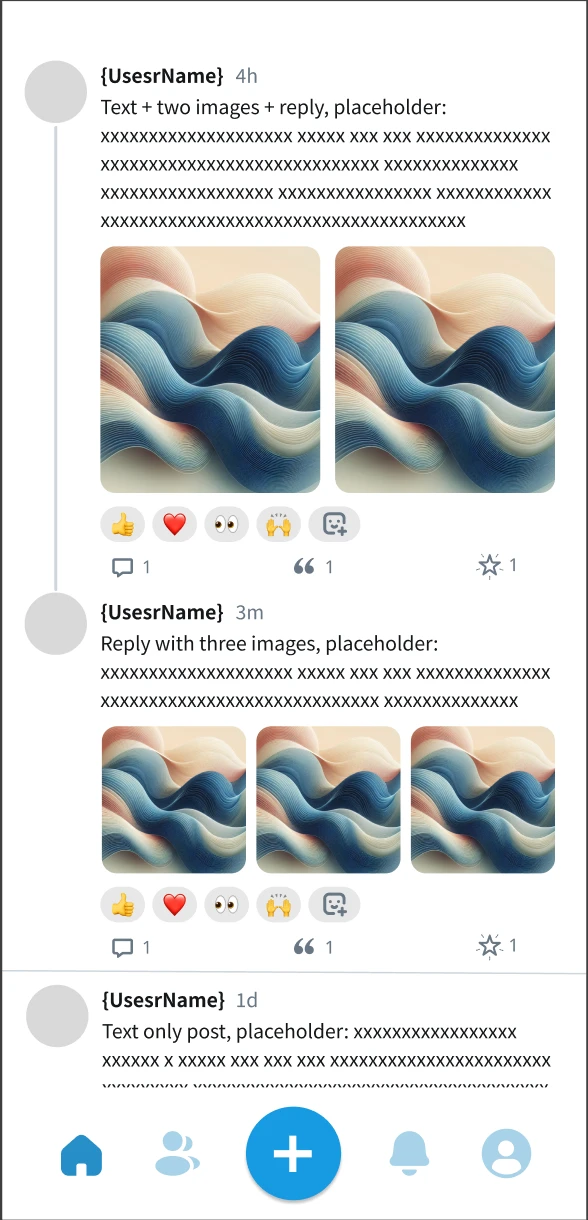
⊹ threaded post design
⊹ visually conveys the
connection between
posts and their "history"

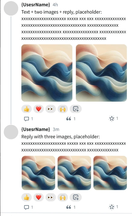
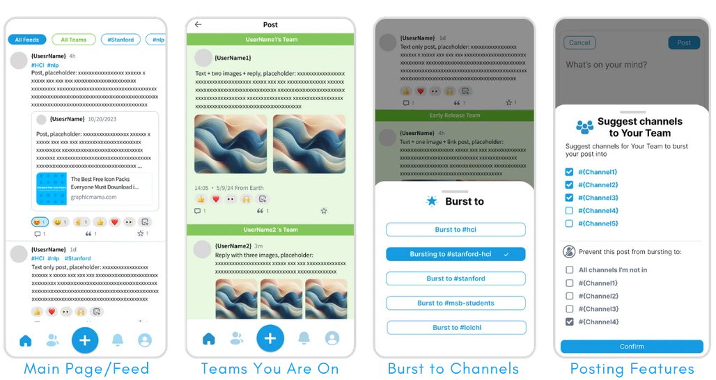
We chose this as our final design as it best reflected our goals to center the journey of thoughts and ideas through the app
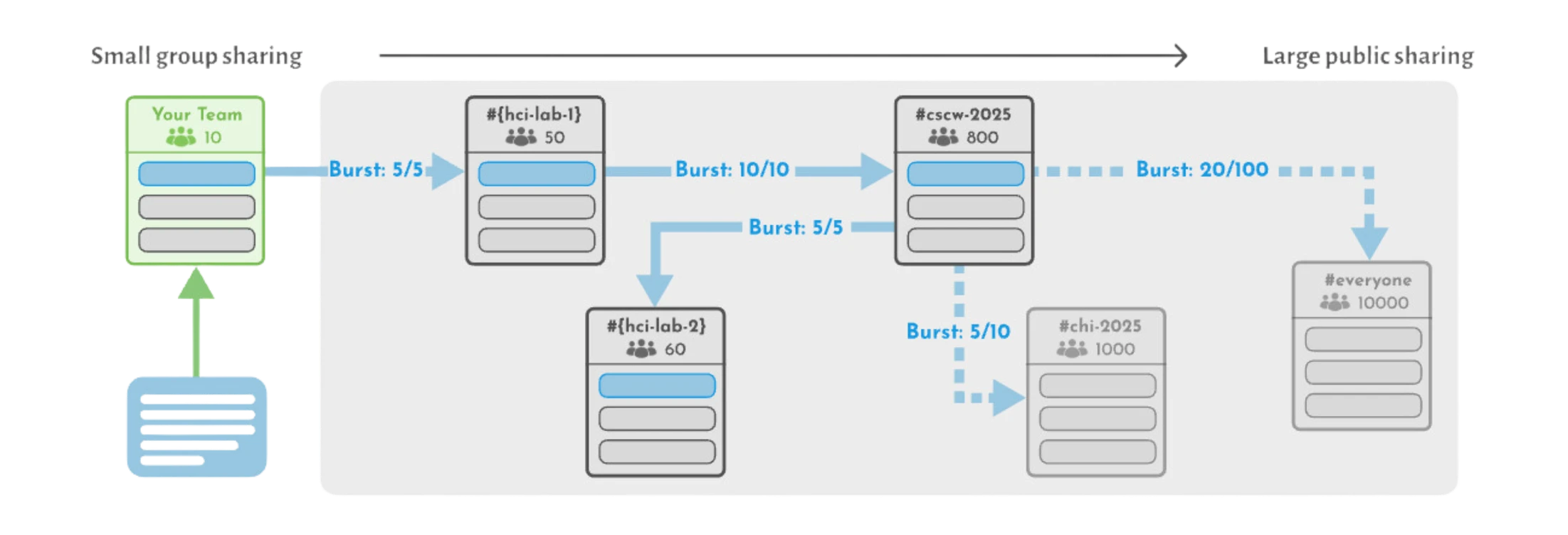
Diagram shows how a post travels from small group to large public, once a post has been bursted enough times to reach the burst threshold, the post will be visible in that channel.
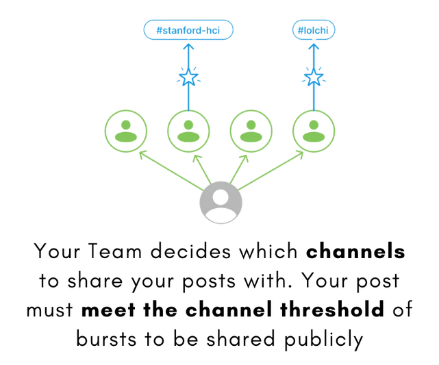

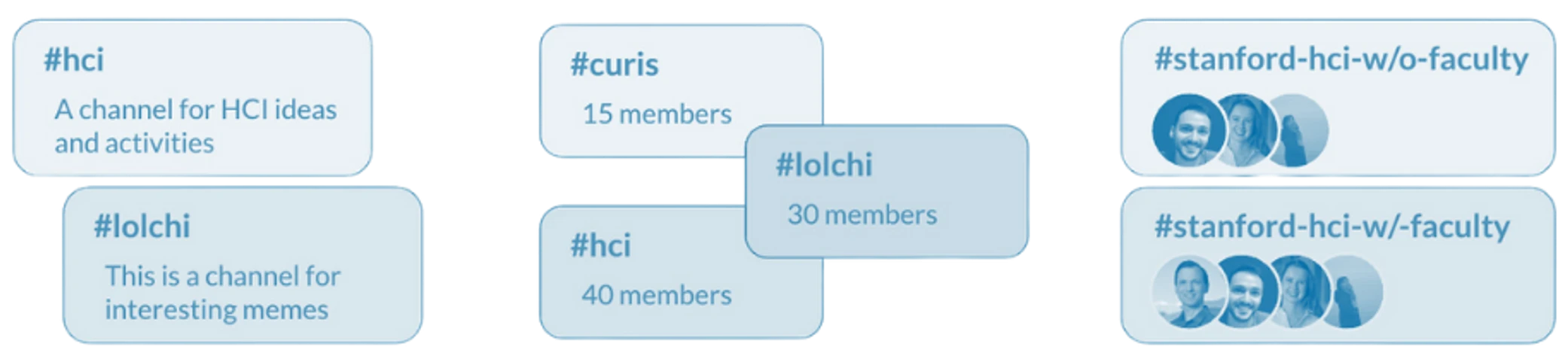
Multiple Distinct Channels
Distinct by topic
Distinct by size
Distinct by member
Flow Diagram
Core features to design:
1. Main feed
2. Onboarding
02.
Research
03.
The Idea
Prototype Test: Text-Based Feed
Mission 2:Onboarding
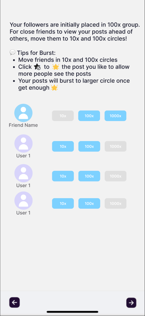
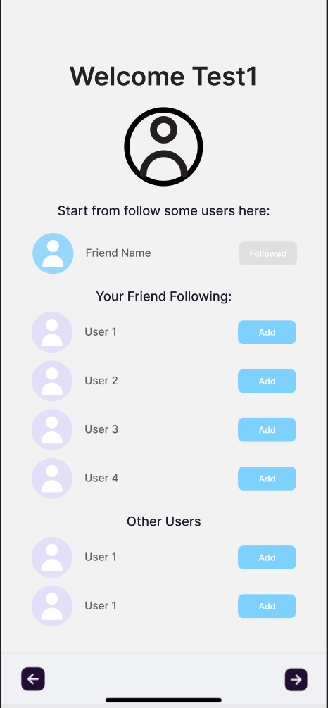
My job was to use visuals and break down our complex concept in a simple way
(the app concept changed throughout the process, so content differs)
Burst onboarding before
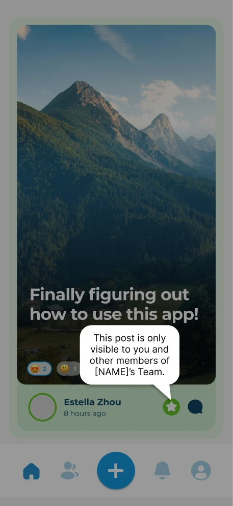
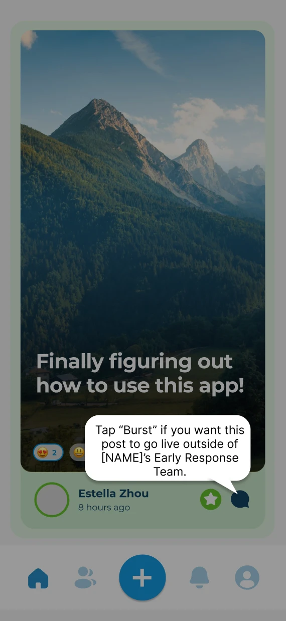
Prototype Test: On Screen Pop-Ups
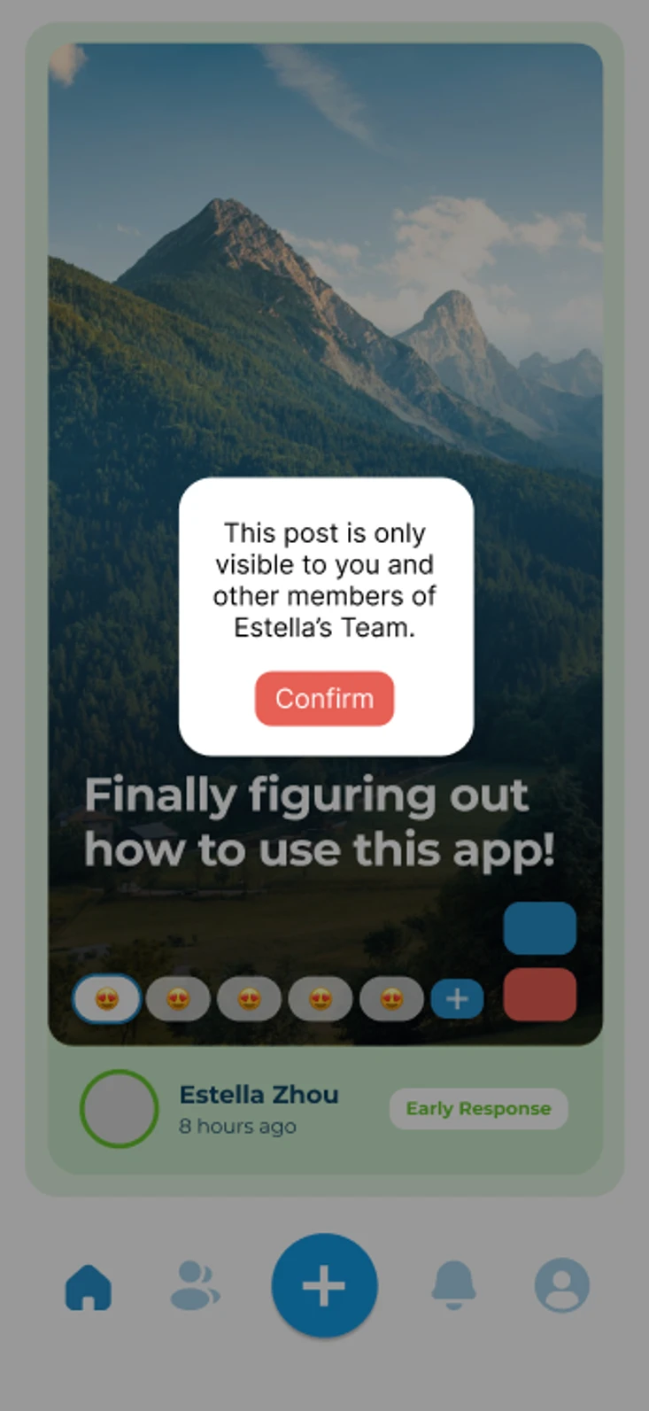

1st iteration
2nd iteration
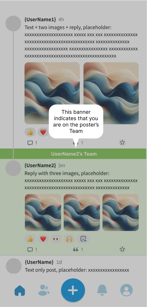
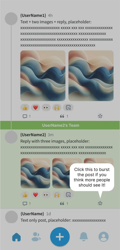
Final iteration (adopted to new app design)
Users wanted more guidance after entering the app for the first time, however we wanted to ensure a low friction experience and minimal click-throughs to reduce drop-off rates
Users liked the direction, but noted that they liked the specifically-directed pop-ups for clarity
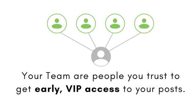
We clarified the connection between the color green and teams in the app, using action-oriented wording to give users a sense of responsibility for widening each post's visibility.
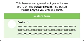
Prototype Test: Swipe-Though Onboarding
Any good app explains the basics to the user before they are on their own
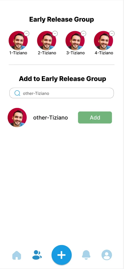
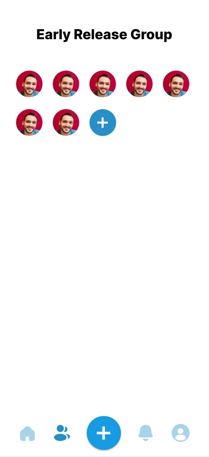
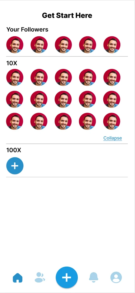
1st iteration (not my design)
The original design aimed to use minimal text, however users felt like this design lacked information and was overall visually crowded
In the 2nd iteration, my goal was to visualize the onboarding concepts
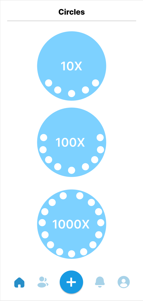
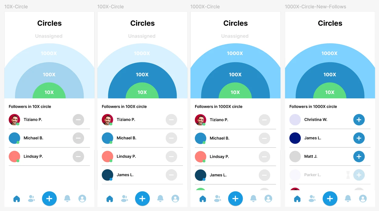
The overall idea
2nd iteration
(Figma)
This design clarified the circle concept, but users were still confused about some mechanisms, so we ultimately decided incorporating more text would be more beneficial than maintaining simplicity
In the next iteration, our goal was to identify the mechanisms that were less intuative and formulate messages that would clearly convey how they work
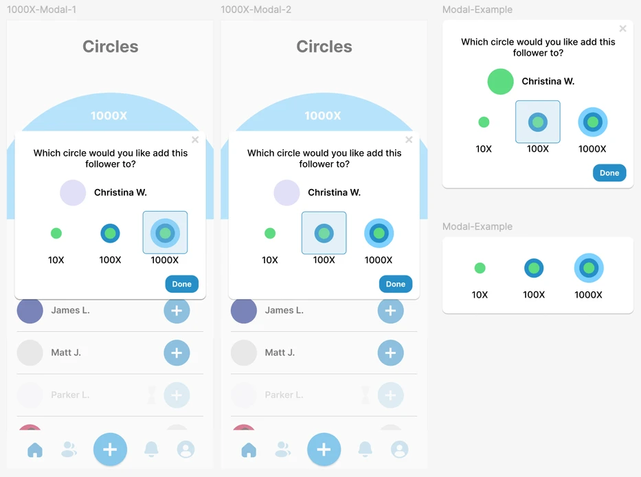
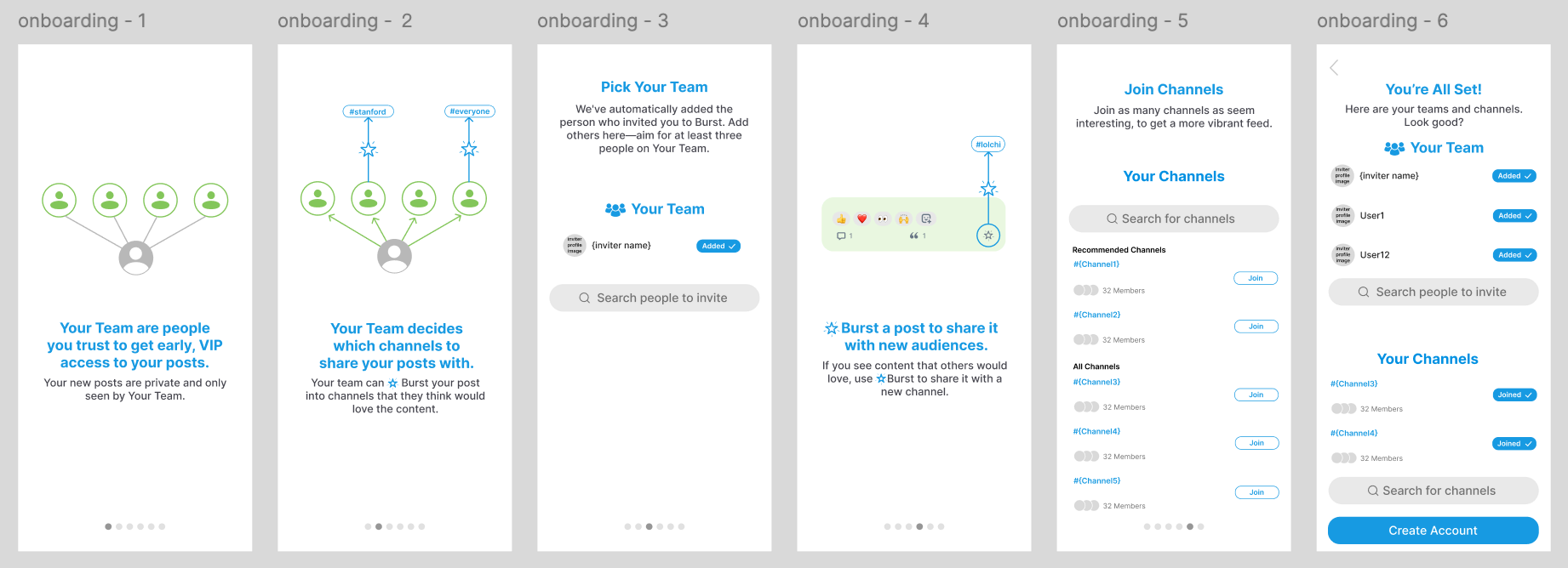

Final iteration (figma)
Final design that prioritizes
clear visuals, interaction, and action-driven language
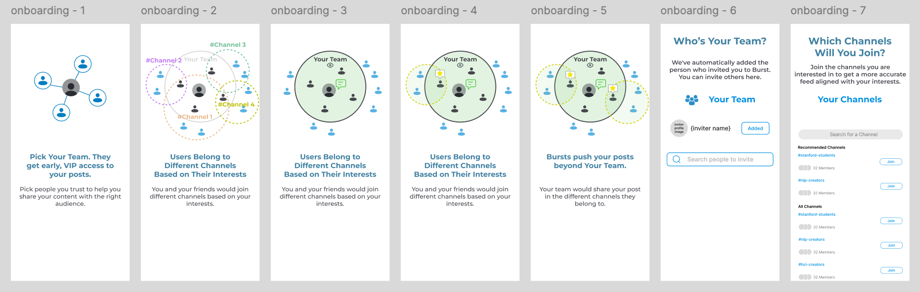
3nd iteration (not my design)
Getting there... graphics were a bit crowded and confusing
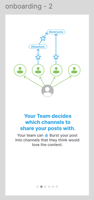
Final iteration! I wanted to refine the wording and simplify the visuals to represent the flow of the app better
React Native (in progress)
As you might expect, there's a lot more that went into designing and building the whole app,
but I hope you enjoyed the highlights :)
Collaborators:
Yutong Zhang and Carmel Limcaoco (Stanford)
Oh, and a quick logo redesign

Before (not my design)
After (my redesign)

The Challenge
How might we bridge theintimacyof personal interactionswith thebroad visibilityof public platforms?